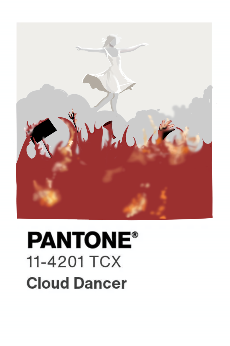
Each year, in an attempt to bridge the gap between color and culture, Pantone handpicks a color intended to encapsulate global events and moods for the approaching year, a choice that greatly influences fashion and branding. Like the abundance of enraged masses on social media, I too was appalled by Pantone’s 2026 color of the year. Cloud Dancer, which was rationalized as “a lofty white that serves as a symbol of calming influence in a society rediscovering the value of quiet reflection,” is just white, which is a ridiculously distant depiction of the cultural moment we’re living in. Choosing neutrality in a time that demands action is a choice rooted in disillusionment and complete ignorance.
Framing 2026 as a year of neutrality is a gross intentional ignorance of the reality of the world we’re living in. None of it exists in a neutral moment. ICE continues to murder innocent people and displace and detain millions through immigration policies that strip families and deliberately position people in unsafe conditions. The Russia-Ukraine war, as well as the conflict in Gaza, still exists, even though they might not dominate our headlines. Civilian deaths, displacement and instability do not cease just because public interest might have moved on. Ignoring these issues most definitely does not erase them.
Contrary to what many of us might believe, color is not neutral even if it is framed that way. Throughout history, restrictions on color have coincided with periods of conformity and control. During World War 2, fabric rationing limited access to dyes, which resulted in muted clothing and visual uniformity. This was a reflection of the restricted resources and limited expression of the time. Similarly, during the industrial revolution, urban pollution created visually dull environments where practicality was prioritized over creativity.
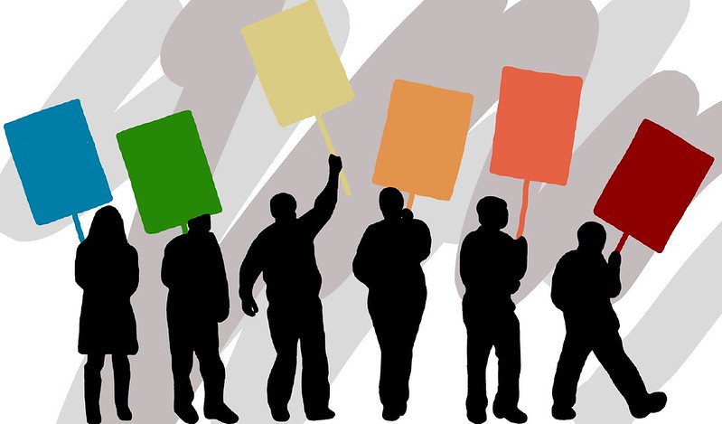
In contrast, color has been reclaimed during moments of resistance. Social movements have always utilized color as an intentional political and emotional tool rather than decoration. For example, The rainbow flag was designed to demand visibility at a time where queer identity was being erased. Red, black and green became defining colors of Pan-African and Black liberation movements, symbolizing unity and resistance to white-supremacy. Yellow was adopted by pro-democracy movements in Hong Kong as a marker of collective oppression. Pink has been reclaimed in feminist protests as a rejection of patriarchy. These movements did not choose neutrality, but rather they chose color because it means visibility.
Today, vibrancy is often treated as excess or something that needs to be muted. Art theorist David Batchelor described a long standing western fear of color. This fear is known as chromophobia, in which the color white is associated with control, refinement and rationality while other more vibrant colors are framed as chaotic and threatening. Colorful Indian and African textiles were dismissed as tasteless despite being highly traded and valued. This isn’t to deny color psychology or preferences but instead to acknowledge that modern aesthetic judgement can be linked to ideas of cultural superiority rather than neutrality.
By framing 2026 as a year of neutrality, we are ignoring the reality of the world we’re living in. None of it exists in a neutral moment. ICE continues to displace and detain millions through immigration policies that strip families and place people in unsafe conditions. The Russia-Ukraine war, as well as the conflict in Gaza, still exists, even though they might not dominate our headlines. Civilian deaths, displacement and instability do not cease just because public interest might have moved on. Ignoring these issues most definitely does not erase them.
Neutrality fits that silence. When we stop looking, we allow ongoing violence, ineffective governance and systemic harm go unchecked without accountability or action. While Pantone positions Cloud Dancer as a response to an “overstimulated world,” overstimulation is not the primary issue we’re facing. In this context, celebrating white as the cultural symbol of the movement feels deeply out of touch. Neutrality suggests distance and detachment, which are luxuries that many people don’t have. For communities fighting for safety and recognition of basic rights, the problem isn’t excess noise. Instead, it’s being ignored. Encouraging quiet reflection in this moment feels like a disconnect from reality. In our privileged Bay Area bubble, it can be easy to think of everything going on around us as “overstimulation,” but it’s crucial for us to acknowledge that quiet reflection isn’t all we need. If anything, quiet reflection is needed to fully comprehend the issues that are plaguing our country, but after that, action is needed to cause change.
On the other hand, it’s important to acknowledge that Pantone is just a commercial brand, not a true representation of a political institution. Even if we looked at it through this lens, it doesn’t even feel culturally true. Maximalism is what Gen Z expects from 2026. Brands are now under pressure to let go of muted minimalism and adopt not only a more sustainable approach but also a louder, more layered, and unapologetically expressive vision of style. I, for one, am sick and tired of minimalism, just like many of my peers.
Economic trends, consumer behaviour and marketing all shape these decisions. However, Pantone explicitly frames the Color of the Year as a reflection of global culture. Once a choice is presented as cultural commentary, it’s fair to critique what that commentary implies.
Neutrality is a privilege most accessible to those who are not directly affected by injustice. Historically, silence and visual restraint have not protected marginalized groups. Visibility has functioned as a way to claim space, assert identity and resist erasure when other forms of power are denied. In the turbulent and injustice-ridden time we’re living in, I urge you to put neutrality aside and think of what cultural commentary truly represents, even when its seemingly unworthy aspects like color.