At first glance, a high school yearbook might seem like a simple keepsake with fun photos, clever captions, and nostalgic memories pressed into glossy pages. But for the students behind Dougherty Valley High School’s annual yearbook it’s far more than that. The book is a 450-page feat of storytelling, reporting, design and logistics crafted entirely by students over the course of the school year.
From selecting the year’s visual identity, to interviewing hundreds of students and tracking down the correct spelling of every name, the process is intense. It’s run like a full-fledged publication, with writers, editors and designers working together to meet deadlines.
Everything begins with content: the stories that define a school year. Whether it’s a football game, academic competition or theater production, the Yearbook team is responsible for capturing the essence of student life. For Academics Section Editor Justin Kan, it all starts with interviewing.
“We value our access time to produce quotes and interviews. We call students out of class and ask them questions, gathering quotes,” Kan explained. “A common challenge I face with collecting content is the lack of creative responses and interviewees.”
To overcome this, Kan makes sure to “dig deep,” asking more open-ended and engaging questions to uncover meaningful moments worth publishing.
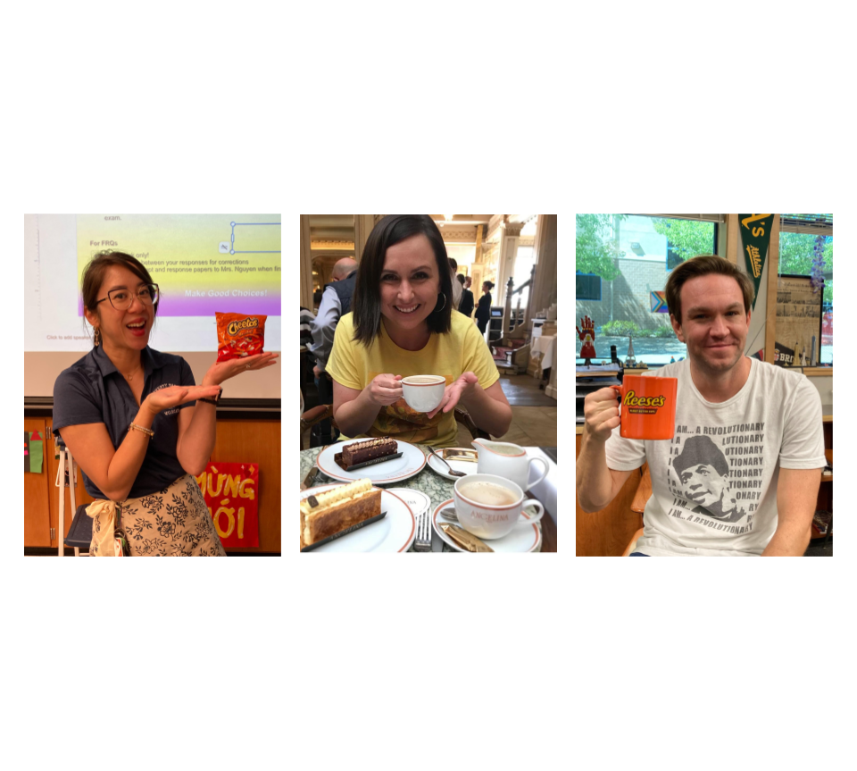
Another solution is inclusionaries: simple, short prompts that anyone can answer. According to Raniya Rajan, an editor-in-chief, inclusionaries are used to “get as many different voices as possible, so it feels like everyone’s part of the book.” The goal is inclusivity, making sure students from every background, grade, and interest group are represented.
Once the quotes are gathered, there is a strict structure that keeps the book consistent. “Captions are always three sentences,” Rajan said. “First, describe the photo. Second, insert a quote. Third, connect it all together. Headlines are short and in present tense.”
Kan added, “We follow specific grammar rules while writing for the yearbook. We always have our captions in past tense while the first sentence is in the present.”
To avoid errors, the team relies on tools like DVHS’ student locator and Gmail to verify names and details. Every spread goes through several rounds of editing. The section does the first edit, then an editor-in-chief before finally, Jeffrey Silverman, the yearbook advisor who oversees the entire publication, takes a look.
“We double-check every name using Gmail and stick to our writing rules to stay consistent. It comes down to careful editing and making sure everyone follows the same process,” Rajan emphasized.
Despite the complexity of the book, the production is almost entirely student-run. The class is split into two periods: a “Mentee” period for beginners that consists mostly of freshmen, and a “Mentor” period for more experienced students. But these two groups don’t work in isolation — they constantly collaborate.
“We have two classes right now,” Sahasra Janga, another editor-in-chief, said. “Third period is for the newer folks — freshmen or people who just want some technical skills in InDesign or Photoshop. Fifth period is for those who want to continue and have more of a say in the design element, as well as working on more challenging stuff.”
To bridge the two periods, Janga emphasizes the importance of face-to-face connection.
“A lot of how we interact is through access,” he said. “I go to access and talk to third period in-person. Collaboration online can be hard—people don’t always respond—but real life exists, so I like to show up and talk directly.”
“Each section has about two editors,” Emma Wen, an editor-in-chief, explained. “Their job is to check in with staff, make sure pages are in on time, and do a first round of edits. Then it goes to the editors-in-chief.”
This year, the editorial leadership was restructured for efficiency.
“This year, we had two EIC roles,” Rajan said. “EIC 1s focused on the details like writing, content, and basic layouts, and EIC 2s worked on style, consistency, and more creative layout stuff. We check for things like tense changes, grammar issues, and if the layout fits the theme. It’s a team effort to make sure everything looks polished and cohesive.”
To organize the whole book, the team builds something called “the ladder” early in the year.
“The ladder is a 400-page spreadsheet that maps out every page and how the book is structured,” Wen said. “A small ladder crew builds it at the beginning of the year. After that, people usually choose spreads based on what they’re passionate about.”
Assignments are partly voluntary and partly guided.
“You can’t just pick one thing and do nothing,” Wen joked. “But it’s great that we get to cover what we care about. For me, I’ve done the library spread for two years because I love it.”
While writing and organization are crucial, the visual identity is what sets DVHS’ Yearbook apart.
“We build a whole visual language around it,” she said. “Fonts, colors, icons [and] photo treatments — all of it has to work together.”
This year, that process took months.
“We spent two months just figuring out the color palette and design elements,” Wen said. “We started with Japanese-inspired vibes but it evolved into something kind of Art Deco, kind of retro, just a blend of everything that felt right. Eventually, it all clicked.”
Wen explained that fonts were chosen to reflect balance.
“We went with a mix: a fancy serif for titles and a very simple sans serif for body text, so it doesn’t feel overwhelming,” Wen explained. “It’s about working together in contrasting ways to [help] emphasize each element.”
The design process is powered by Adobe Creative Cloud, especially InDesign, Photoshop, and Illustrator.
“I hate Adobe,” Wen laughed. “But it’s the best we’ve got.”
The team also uses a shared CC Library — an internal database of graphics and templates.
“We have over 2,000 graphics in there. Everyone can access icons and flash graphics instantly,” Wen said.
Design consistency is essential, and every layout goes through a dual review process: one person for writing and one for design. That level of attention adds time, but the team believes it’s worth it.
“We used to have one person approve everything. Now it’s more collaborative, but also more intense,” Wen admitted.
For the creative flair, the team leans into select themes each year. Last year, Wen turned each grade into a citrus fruit.
Wen’s favorite is the “Color Fun” spread, which explains the software and systems they use.
“It shows our design process — InDesign, Procreate, Slack, even iMessage. It’s a geeky spread, but I love it,”
Though the final book is submitted in April — printed and shipped from Kansas — the work doesn’t stop. The final weeks of the year during May are devoted to legacy-building.
“Juniors each make a slide with their theme idea and present it. Then we do hallway discussions — very secretive,” Wen added with a laugh. “If you see us in a circle whispering, it’s about the next theme and you should not listen to it. It’s very secret.”
While the yearbook is known for pushing boundaries in style, what remains consistent is the students’ passion and dedication.
“It was more work than usual,” Wen reflected. “The design was ambitious, the deadlines were tighter, the team was larger. But I think we pulled it off.”
Even as they joked about late-night design tweaks and overly complex caption numbering systems, one thing is clear: DVHS’s yearbook isn’t just a project—it’s a labor of love. A visual and written time capsule created by students, for students and about students.
As Janga puts it, “It’s a fun thing to do. And when you’re part of something like this — it just feels right.”